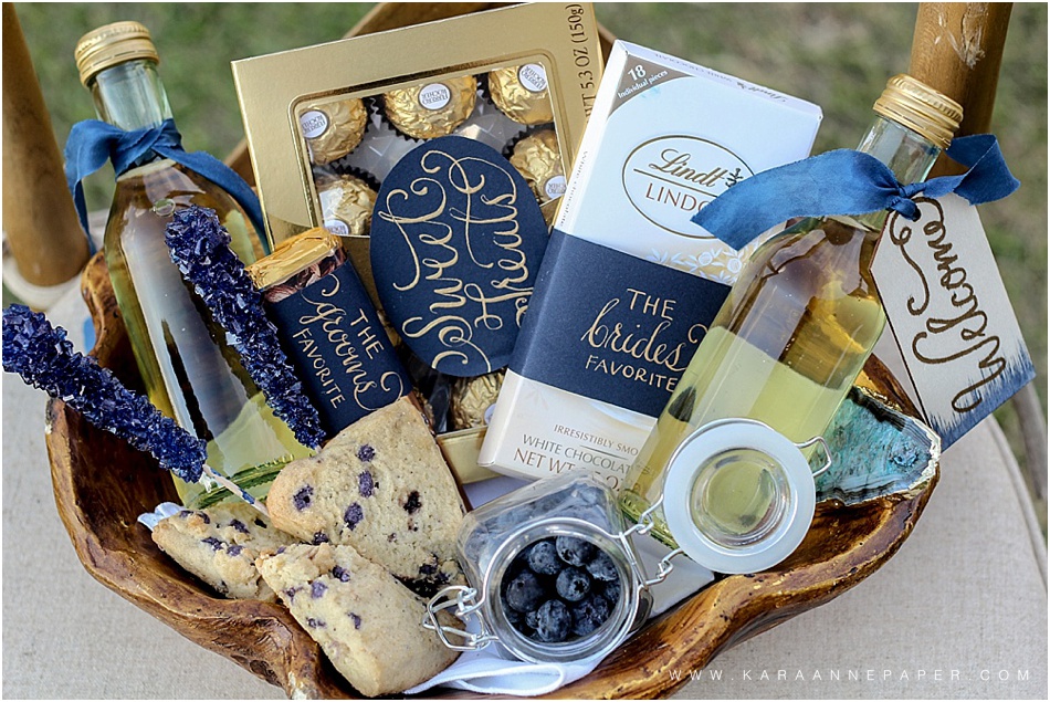
Geode Inspired Wedding Suite


Finding the right calligraphy tools and ink is the key for those wanting to learn the art of calligraphy. Before getting into the details, remember calligraphy takes practice, practice, practice! It takes time to create your "style" and confidence. The more time you spend writing your letters over and over, the better and quicker you will become. There will be times when the ink splats or bleeds..Do not be discouraged! It happens to everyone.
Let's talk details...
I have tried countless inks, nibs, paper, and holders all to find out that I always want to go back to my favorites. Once you find a favorite, stick with it, but don't hesitate to try new things. You will find that certain inks and nibs work well for certain projects. There are different points on nibs that will create different ink strokes. With trial and error, there are particular inks that I use on certain paper or mix with each other. This post is to introduce what I find works best for me. I've included links for each item so you can try them for yourself. I hope you find this helpful! Feel free to comment or ask any questions.
Moon Palace Sumi Ink, is a jet black ink great for mostly any calligraphy project. It works well on thick cotton paper, textured paper as well as slick calligraphy paper. It also has a slight sheen, whereas the majority of other black inks I have tried seem to have a flat, more matte appearance. Click here to purchase! (i70) Available in four different sizes.
Metallic inks are perfect for weddings! It is by far the most popular requests with my clients. If you are looking to make a design feel more formal and/or special Dr. Martin's is a great choice. It is waterproof when dry, which is always a plus. (My favorite is the "18 carat gold" and "Silver") Click here to purchase! (i27)
There are two main types of holders..Straight & Oblique. I prefer an oblique holder, because it distributes the pressure more evenly than a straight holder. It also feels more natural when writing with the slight angle. Click here to purchase! (H121)
Finding the perfect nib can be tricky. The best way to find what works best for you is order several different types and start the elimination process. Certain nibs require more pressure when writing as well as certain angles. If you tend to place more pressure on your writing tools, this is a nib to consider. It creates a nice weight stroke and holds a good amount of ink. I use it for everything! Calligraphy, illustrations, doodles,.. you name it! This is my all time favorite. Click here to purchase! (N82)
Whether you are practicing or illustrating for a project, this unlined writing pad is the easiest to work with. It is a slick, smooth paper that works with almost all nibs and scans without streaks or shadows. This is especially important if you plan on scanning in your artwork in order to use digitally. Click here to purchase! (P36)
I can never have enough clear dishes for ink. I prefer the small jars because if I do not use all of the ink poured I can easily pour it back into the bottle. If you mix a custom color ink and it is important to save the excess ink, be sure to purchase a little dish that comes with a lid. Click here to purchase! (S620)
Remember the metallic ink i talked about? If you love that brand, I recommend the Spectralite Gray Ink. It includes six different shades of gray from light to dark. The consistency of this ink tends to be thicker than the metallic. If it does not glide easily on the nib, add a few drops of distilled water and stir the ink. This also applies to all thick based inks.
After hours of collaborating and designing a wedding suite for a couples big day, the most exciting thing is to finally see it in print! (and of course, hear the Bride's reaction when she sees them) The soft cotton paper, the texture of beautiful letterpress or engraved art and the flowy ribbon can make an artist's heart skip a beat! When sending off the paper suites to their new home, every designer hopes to one day see them again. Yes photographers, we are talking to you. :) We LOVE seeing how you capture these little pieces of art and we greatly appreciate you taking the time to do so!
When photographing an invitation suite, I always create a little mental check list of the details to capture. I also plan in advance the styling and look I'm going for. Don't be afraid to reference styled suites on Pinterest or the way other photographers approach it. Doing a little homework before hand never hurts.
Ok! Now, want to see an example of pretty styling? Katherine and Cory's wedding invitation was the perfect combination of feminine elegance mixed with the shabby chic nature of their southern farm wedding in Texas. The styling was spot on! You can find more of their wedding images on Style Me Pretty. Styling and Photography by Mustard Seed Photography
Here are a few of my favorite styling ribbons and fabrics. I would love to hear your favorites too! Tono & Co, FrouFrou Chic, Stella Wolfe, Heirloom Bindery
Featured above: "Pale Rose Dust" from Stella Wolfe and "The Margaery" from Mrs. Box / Stlying by Kara Anne and Photography by Colorbox Photographers
Whether you are having a desert wedding or just love succulents and the colors that compliment the gorgeous desert views here is some fun inspiration for your wedding day! Happy Friday!